 Kari Switala
1 min read
How To Create a One-Liner Using the StoryBrand Framework (and How To Use It)
Ever tripped over your tongue when trying to explain what you do at a networking event or cocktail party?
![How To Build a Homepage That Works With StoryBrand [Client Examples]](https://www.wildfigmarketing.com/hubfs/bigstock-Build-Website-And-Webpage-Desi-471455721.jpg)
Imagine you’re selling an incredible product, but your brick-and-mortar storefront is crumbling to the ground. Do you think a passerby would trust your product?
That’s what it’s like to have a bad homepage. It doesn’t matter how good your product is, if your website overwhelms customers or gives them a less-than-perfect first impression, it’s almost guaranteed to cost you money.
On the flip side, having an incredible homepage — one that tells your business’ story in an engaging way — can be a huge boon to your bottom line!
Having recently created a brand new website for our client ErgoWorks, we wanted to show you how we used StoryBrand to help us build them an awesome website. As we break down each section of ErgoWorks’ homepage, feel free to use these tips and tricks to help you create your own!
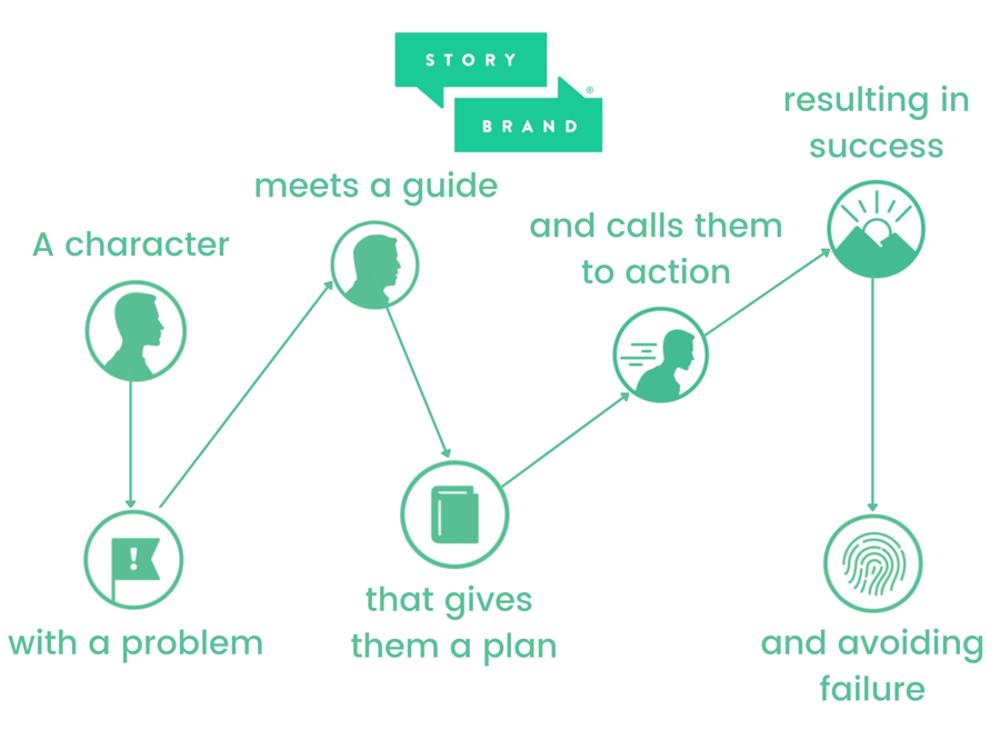
The StoryBrand framework is a marketing framework that uses the power of storytelling to help businesses connect with potential customers by empathizing with their journey and goals.
As a certified StoryBrand Guide, one of the key tools we use to help us build our clients a beautiful website is the StoryBrand website wireframe template.
A StoryBrand website wireframe is a specific layout that includes all the components that most companies should include on their homepage. The goal of the wireframe is to:
You can think of your homepage like your digital storefront. You want everything to look beautiful and inviting in order to persuade people to continue down the sales process — to walk into your store. And the StoryBrand website wireframe makes it easy for prospects to do just that!
Let’s dive right into the elements of our client’s new homepage.

This first section is called the header. Your header should let people know what you offer using as few words as possible. It includes:
As you can see in the screenshot above, we included each key element in our client ErgoWorks’ website header. While things like logo and navigation can be pretty straightforward (but keep your navigation simple please — there’s a place for all your internal links down the road), the tricky part is simplifying what your customer wants and what your company does into concise copy.
In his book “Marketing Made Simple,” StoryBrand creator Donald Miller writes, “While colors and images and feel are fine, it’s words that sell things. Your website needs to include words that sell.”
Our client ErgoWorks offers a wide array of services all related to employee injury prevention. So our challenge was to boil down what they do and what their customer wants to a single title and sentence.
What your customer wants:
“Expert Partners in Prevention"
ErgoWorks’ customers are local employers who are hoping to reap the benefits of less employee injuries on the job, but they don’t know how to make this happen. So, summed up, their customers want an expert partner by their side to help them prevent employee injuries.
What your company does:
“Through injury prevention, ergonomics, and job analysis, ErgoWorks provides customized solutions for employers in the Twin Cities and surrounding areas to improve employee productivity and job satisfaction, reduce worker’s compensation claims, and improve employee wellness.”
This description is on the longer side. Our client wanted to make sure the description included every facet of their services, and we wanted to honor that. Still, here we accomplish that task in a single sentence!
Call to action:
“Schedule a Discovery Call”
The most effective CTAs are written in present tense. Also, notice that the CTA is placed in multiple areas of the Header (and throughout the Homepage). When visitors land on your page, their eyes read your content in either a Z or F pattern. So you want to place CTAs along the path that the human eye travels.

The value stack should list three simple successes that your customer will experience if they choose to work with you.
The purpose of this is to help customers be able to visualize exactly how you can help them. You want to keep each “value” as simple as possible — they should be no longer than four words each. Additionally, you want to start each one with a present-tense verb.
For our client ErgoWorks, we chose:
As Donald Miller writes, “A story without stakes is no story at all.”
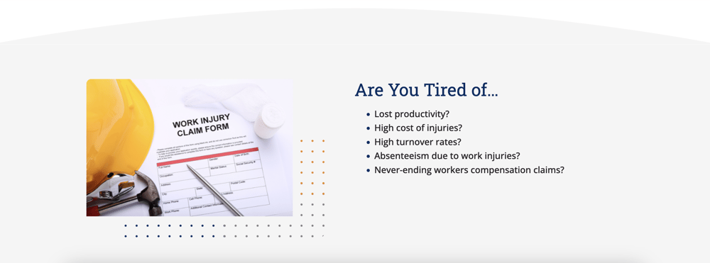
The stakes are where the tension lies and where the conflict is in your brand’s “story.” Conflict is what makes a story interesting, so it’s important that you get this right if you want to keep your reader (and potential customer) engaged. This is where you show that you understand exactly where the conflict is in your customers’ lives by listing the main problems that you can solve for them.
Our client ErgoWorks solves a wide variety of problems for their clients. As you can see from the screenshot above, we narrowed them down to 5 specific problems. And while we chose “Are You Tired Of…” for the heading in this section, you could also use “Do You Struggle With,” or another question that shows empathy for your prospects' problems.
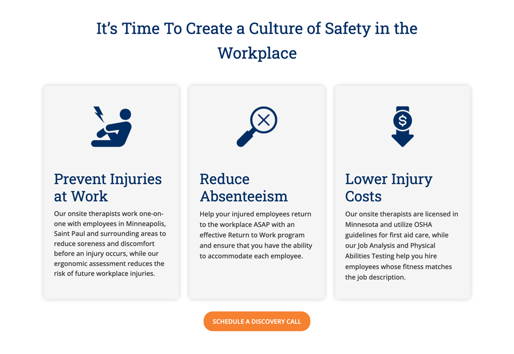
The point of this section is to illustrate the value you can provide your customers and clients with. You can choose to either highlight a few of your most important services, or a few critical benefits your service provides.
To keep things simple, you want to choose just three. For our client ErgoWorks, because they offered a wide range of services, we chose to highlight the main benefits of partnering with them, calling back to and expanding on their Value Stack.
In the description of each service or benefit, you want to limit the copy to a single sentence (or two sentences at most). Again, on the home page your goal should be to write as simply and clearly as possible so readers don’t get confused or overwhelmed.

Every hero needs a guide, and in this section, you want to position yourself as the experienced guide who can lead your customers to victory. The main qualities of a good guide are empathy and authority, so you want to emulate both of those qualities in this section.
It’s also a great idea to use customer testimonials and photos in this section. These will help solidify your authority by showing how you’ve helped others. Alternatively, you could show logos of clients you’ve worked with, press logos, or certifications.
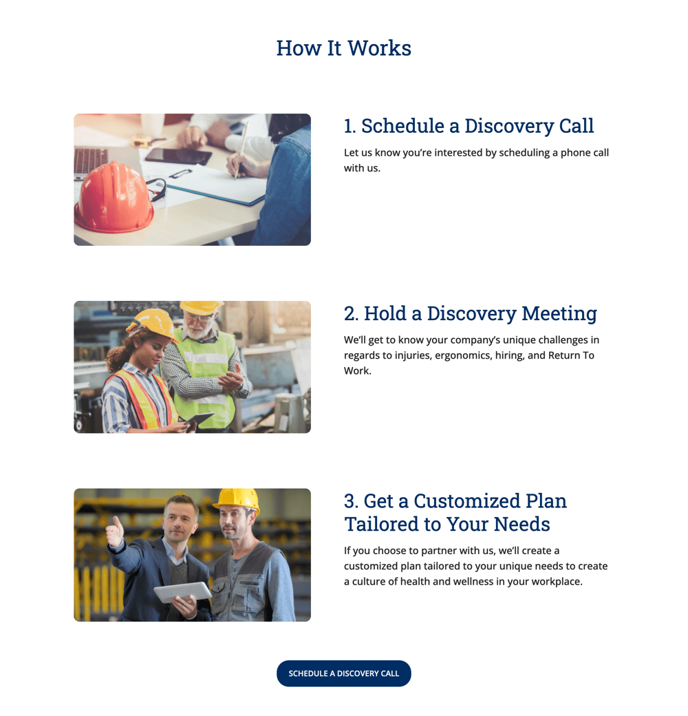
In this section, you’re going to tell customers exactly what steps they need to take to do business with you. And no matter how complicated you want the process to be, the StoryBrand framework challenges you to make it as easy as 1, 2, 3.

This section is a short paragraph where you state the problem that your customer faces, the solution to their problem that you offer, and the success they’ll see when they work with you. Here’s a breakdown of ErgoWorks’ explanatory paragraph in the above screen shot:
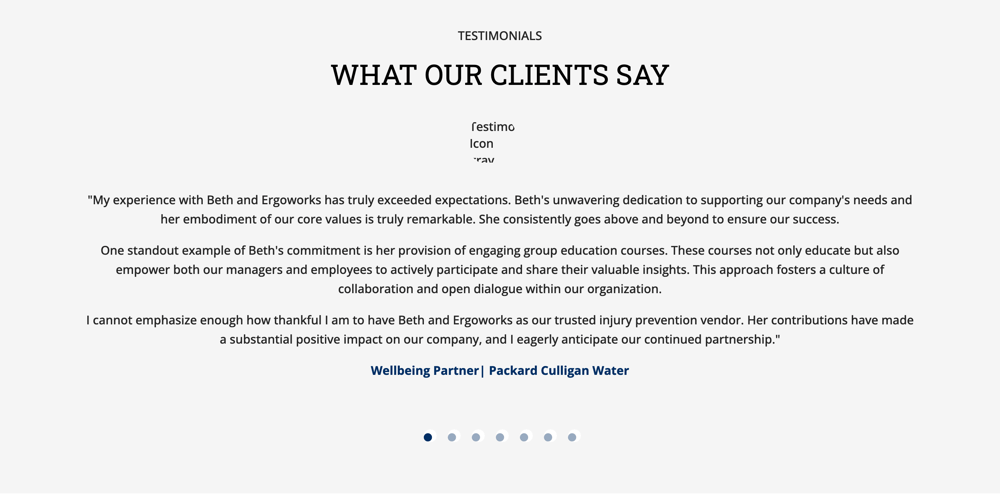
Nothing will lend you greater authority than your client testimonials. According to “Marketing Made Simple,” here are a few types of soundbites you can look for when collecting testimonials:
Many of ErgoWorks’ testimonials focus on adding value. We’re sure this doesn’t need to be said, but we’ll say it anyway: When you can show how customers have raved about the quality of your services, people are much more likely to purchase from you!
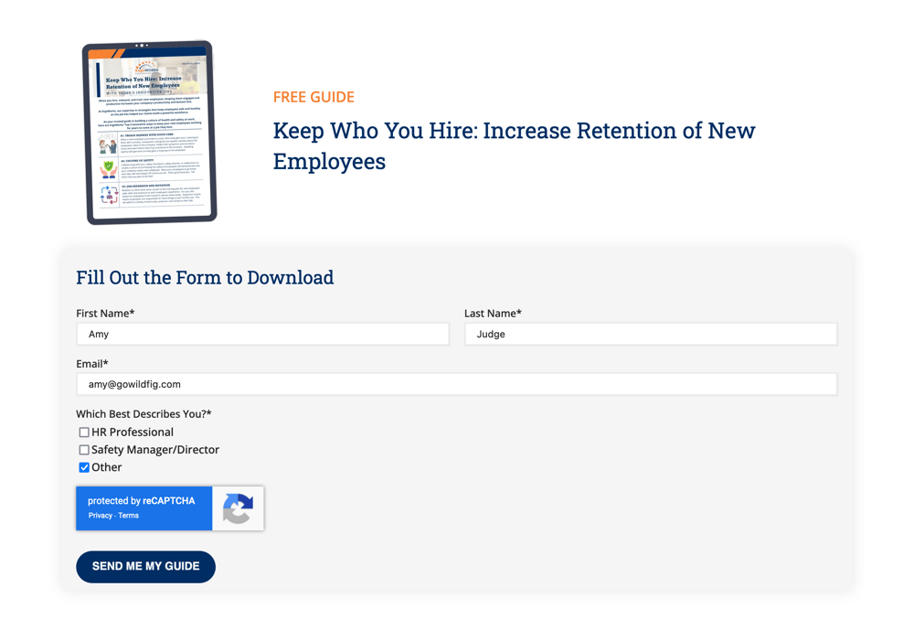
This section is designed to help you capture the email address of your reader. In order to do that, you need to choose (or create) a free resource that you can offer to potential clients. Make sure this resource provides true value to your prospect, (as in, it’s something they can really use!).
ErgoWorks chose to feature their PDF, “Keep Who You Hire: Increase Retention of New Employees,” as their lead magnet. This is a short guide that walks potential clients through some easy ways they can reduce employee turnover, which is a common problem that HR Managers face. And HR Managers represent a large portion of ErgoWorks’ target market.
Once you have your reader’s email address, you can stay connected with them even if they’re not ready to buy immediately.

Remember when we said to keep the navigation simple? That’s because the place for all your additional pages and links are right here in the footer, AKA the Junk Drawer. This is a key design decision, as it ensures that you’re not distracting readers with too many options in the top navigation.
The idea is that the reader will scroll down the page and read the copy instead of jumping around your website. So go ahead and add your internal page links, privacy policy, social media links, copyright info, and anything else your little heart desires!
Interested in how using the StoryBrand framework could give your homepage new life? At Wild Fig Marketing, we’re StoryBrand certified and ready to help you simplify your brand’s message to capture your audience’s attention. Schedule a discovery call with us today to talk to us about incorporating StoryBrand into your website!


1 min read
Ever tripped over your tongue when trying to explain what you do at a networking event or cocktail party?

1 min read
Raise your hand if you thought your website’s About Us page wasn’t an important part of your content strategy. 🙋♀️

1 min read
Why do customers walk away without buying?