 Amy Judge
1 min read
6 Reasons You Need To Use Video on Your Website
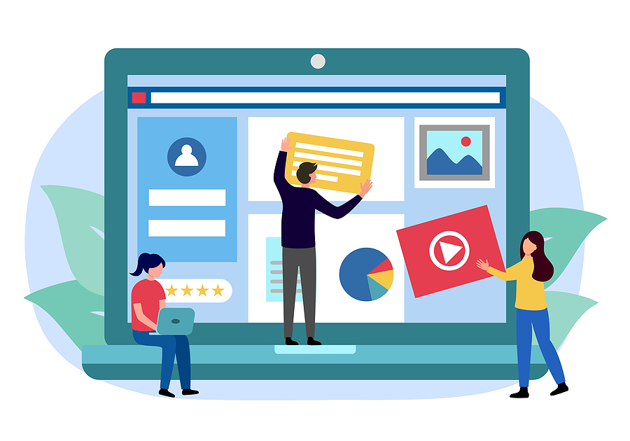
Your website is your company’s digital storefront. It shows visitors who you are, what you do/sell, and who’s on your team, and it offers an...
If your website feels like it should be doing more than it is … you’re probably right. But it’s also probably not your fault.
A lot of businesses assume something is wrong with their website when the real issue is that the internet is changing. Search is changing. People are changing. And the way visitors decide whether to trust you (or click away) is faster and more unforgiving than it used to be.
It all boils down to just three key factors affecting websites: visibility, clarity, and usability.
Instead of treating this like a typical list of tips, let’s run your site through a Three-Level Website Diagnostic Test. Start by asking yourself:
Think of it like a quick checkup. Before you sink time into a redesign, this will help you pinpoint what’s actually causing people to bounce, so you can focus your efforts where they’ll make the biggest difference.

One of the biggest things to understand about key factors affecting websites nowadays is that SEO (Search Engine Optimization) still matters … but it’s not the whole story anymore.
For years, SEO has been the process of helping people find your site through search. You research keywords, optimize your headlines, tweak your meta descriptions, and create content that answers what people are typing into that Google searchbar. The goal has been simple:
Show up higher in results → get more clicks → make more sales
But the search experience is changing fast.
Today, when someone types a question into Google, they often don’t get a list of links first — they get an AI Overview right at the top of the page. It’s quick, tidy, and genuinely helpful for readers who just want a straight answer. And because the overview gives them what they need immediately, a lot of people never click through to a website at all.
That’s great for the user … but less great for businesses that rely on those clicks to bring readers to their site and introduce them to their product.
This is where AEO (Answer Engine Optimization) comes in.
Instead of only asking, “How do I land on page one of Google search results?” (I mean, really, who even opens page two?), AEO asks a slightly different question:
“How do I make my content one of the sources AI pulls from — and cites — when it generates the answer?”
You’re probably feeling a little frustrated with AI right about now. It’s making your keywords feel irrelevant, your website harder to find, and your readers few and far between. It’s robbing you of the clicks you work for, right?
Before we go any further, I need you to adjust your mindset. AI isn’t the villain here. You shouldn’t be competing with it for clicks … you should be using it to earn them. Think of it like a tool (not an obstacle!).
Make your website the kind of source AI wants to pull from — clear, credible, and easy to understand. That means focusing on a few key areas that both readers and robots care about:
Still confused? I don’t blame you — it’s a lot to keep track of! If you want the deep-dive version with more specific examples, you can read our full post on AEO here:
(🚨Spoiler Alert🚨: there’s a handy-dandy downloadable cheat sheet at the end — I’d recommend keeping it on hand until AEO feels like second nature!)
The AI Overview isn’t where every reader’s journey ends. Many people don’t trust the summary, and plenty prefer to read both the AI Overview and the traditional first page of Google search results. Others even go out of their way to bypass it entirely.
The takeaway? AEO is one of the key factors affecting websites today, but it’s still just a first impression — not the end-all.
You should still make SEO a priority when creating content for your website. It’s one of the most reliable ways to improve your visibility on Google and earn consistent, qualified traffic over time. The higher you rank, the more likely people are to click through to your site, explore your content, and take action.
Ask yourself these questions to see if your website is on the right track:
If you answered mostly yes: Great! People can find you.
If you answered mostly no: Your site might be invisible to the very people looking for you.

If you’ve made it this far, you’re a statistical outlier.
In the early 2000s, the average global attention span was about 2.5 minutes. Then it dropped to 75 seconds by 2012, and the internet collectively lost its mind. Right about then, goldfish started getting dragged into the conversation.
Then over the past five to six years, it dropped again to around 47 seconds, which felt even more dramatic. That’s less than a minute. Are we nothing but slack-jawed, brainless zombies?
Now that crisis seems almost relaxing …
… because Gen Z decides in about 1.7 seconds whether they’re going to engage with social media content or scroll away. It’s hard not to wonder what that means for their attention span on websites.
At that rate, we can only imagine how long the following generations will stick around. Maybe just for a blink. That’s why website designers have to be more efficient than ever.
I mean — 1.7 seconds?!
That’s basically two heartbeats.
In the past, you could ease into your messaging. You could start broad, build curiosity, and slowly reveal your offer.
Now, that approach often backfires. Most visitors arrive on your site already thinking:
“Does this answer my question?”
“Is this for me?”
“Do I care?”
“What’s next?”
They decide quickly — basically instantly. If your visitor has to hunt for the point, they simply won’t.
Because one of the key factors affecting websites today is that visitors aren’t browsing your site like it’s a magazine anymore. They’re scanning it like it’s a TikTok caption: quickly, skeptically, and already halfway to the back button.
A quick exit isn’t just a missed opportunity. It’s wasted effort and wasted budget. Whether someone found you through SEO, Google’s AI Overview, paid traffic, or a recommendation, the result is the same: you paid for the click, but your website didn’t make the sale.
To design for shorter attention spans, you don’t need to strip your site down to nothing. If that were the case, you might as well just publish a plain word doc with a bulleted list of information. Boooring!
You can still have beautiful design, but beauty without clarity is a bounce waiting to happen. Just make your purpose obvious, and your value immediate.
That usually means:
Imagine you own a nail salon. Someone Googles, “What’s the best type of manicure?” They land on your page and get greeted with a clean, artsy illustration of a fresh manicure.
Boom. Strong visual hook. Their attention is snagged just long enough to at least glance further.
Next, instead of hiding the answer in the last paragraph (in an ill-fated attempt to force them to “read their way” to it), you give it to them immediately in the headline: On a Budget? GelX Is One of the Best Options
Boom. You lead with payoff. They know the answer they’re going to walk away with.
Now they’ve gotten what they came for … but you’ve also planted the next question: Why is GelX the best?
A few paragraphs later, you mention that GelX lasts longer than standard polish. You bold the line so it’s impossible to miss, even for a half-focused scanner.
Boom. You made your page easily scannable.
Now they’re thinking: Okay, how long does it last? What does it cost? Does it damage nails? Is it safe? Each answer pulls them one step further down the page, until they reach the end already convinced.
Boom. You planted the right questions in the right order, and the reader followed the trail all the way through.
And that’s where your CTA should be waiting — something simple, like a colorful button prompting the reader to book an appointment at your salon.
Psst … if you’re looking for some CTA inspo, check out this blog post 👉 How To Design a Great Call To Action (CTA)
Ask yourself these questions to see if your website is on the right track:
If you answered mostly yes: Great! You’re holding attention.
If you answered mostly no: You may be losing people in mere seconds.

One of the most overlooked key factors affecting websites today is mental effort; the more effort it takes to move through your site, the less likely someone is to take action. If the experience feels confusing, slow, or messy, people won’t push through. They’ll leave.
At this point, your visitor has found you and stayed long enough to be interested. The last hurdle is usability — a.k.a., that thing that makes your site feel professional and trustworthy.
The reader should never have to pause to squint at the screen to try to make out a pixelated image or tricky font. They should never have to go out of their way to copy/paste embedded links into another browser; they should be able to just click the link and be whisked away.
Everything — from the words on the page to the contact information to the CTA — should feel intuitive. If your reader is confused, they’re frustrated.
An uncluttered layout:
A clean menu:
Text people can read:
Functional visuals:
A mobile-first design:
Clickable actions (not extra steps):
A bug-free experience:
Optimize for fast loading times:
Ask yourself these questions to see if your website is on the right track:
If you answered mostly yes: Great! Your site is user-friendly.
If you answered mostly no: Your website may be creating friction and trust issues.

Alright. No more pop quizzes or lists of statistics. The takeaway is simple:
These three factors don’t work separately — they work like a chain.
Level One: Visibility brings people to your site.
Level Two: Clarity snags their attention and keeps them on your site
Level Three: Usability makes it easy for them to take action.
If one level is weak, the whole system leaks leads. Poor visibility means no traffic. A boring page that makes you work for an answer means people bounce in search of an easier source. Bugs and slow loading times mean people get frustrated and leave.
So if your site isn’t performing like it used to, don’t panic. It may just be playing by outdated rules.

So … how did you score on the mini quizzes? 😳
If you had a few “mostly no” answers, don’t stress about it. The internet is a wild and constantly-evolving place — it feels like as soon as you’ve got one thing mastered, it all changes. We don’t blame you for falling a little behind.
If you want help identifying what’s holding your website back (and what to do about it), schedule a call with Wild Fig. We’ll walk through your results, pinpoint the biggest opportunities, and help you build a website that actually works.

1 min read
Your website is your company’s digital storefront. It shows visitors who you are, what you do/sell, and who’s on your team, and it offers an...
1 min read
Building a new website for your business? Or thinking about redesigning your current site? While you’re choosing which theme, colors, photos, and...
![How Often Should I Refresh the Content on My Website? [And Why Is It Important?]](https://www.wildfigmarketing.com/hubfs/bigstock-Technical-Support-Programming-460826949.jpg)
1 min read
If it's been a while since you made updates to your website...it might be time.