 Amy Judge
1 min read
Why It’s Crucial To Humanize Your Brand in the Age of AI [+ 12 Ways To Do It]
With increased adoption of smart technology, AI, and automation, brands have the opportunity to accomplish more faster—potentially outperforming even...
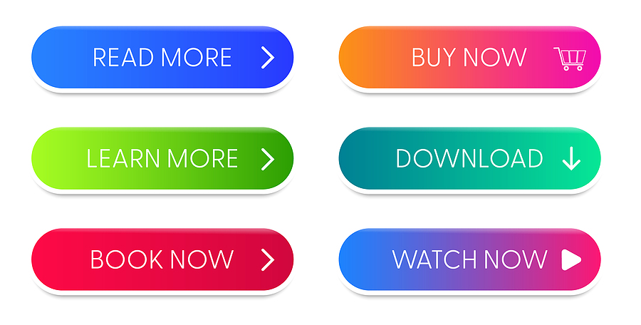
Even if you have no idea what a call to action is, chances are good that you’ve seen hundreds, maybe even thousands of them! Every time you see a “Buy Now,” “Sign Up Today!” or “Register” button in an email, blog, or on a website, you’re looking at a CTA.
If you are familiar with CTAs (i.e., you write copy), then you’re probably well-acquainted with the constant struggle of figuring out what words, placements, and colors will convert the most prospects.
We believe that if you stick to following certain guidelines, designing a CTA can be easy. Below, we’ve broken down the steps to creating a great CTA, complete with examples of effective CTAs from popular brands.
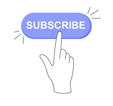
A call to action, or CTA, is a button or a hyperlink that asks users to take a specific action. CTAs are most often used in emails, blogs, advertisements, landing pages, and websites.
CTAs are usually written as a command, like “Sign Up Today” or “Book an Appointment.” They can appear as a “button” graphic, or as a hyperlink. By clicking on the CTA, users will be directed to a separate page where they can complete the action.
CTAs work to remove the friction of moving customers down the sales funnel. Without a CTA, prospects are far less likely to take any action after reading your content. Users may also struggle to see the route to buying a product or signing up for a service.
A clear CTA can:
You want your CTA to be persuasive, so you need to use actionable, demanding language that kicks people into gear! Here’s some examples of power words you can use in a CTA:
|
|
When writing your CTA, highlight the benefits of the action you’re asking people to take.
What sounds more convincing, “Sign Up Today” or “Sign Up For VIP Access”? The second example is the more persuasive option because it shows the clear benefit of signing up: users can get “VIP Access” to whatever it is you’re offering.
That’s not to say that simple, two-word CTAs can’t have a strong impact as well! There’s a reason why everyone uses “Get Started.” It’s short, to the point, and decisive. To decide between a short CTA and a longer one, think about which type of CTA would make the most sense in the context of your content. For longer CTAs, try to stay under seven words.

Humans are emotional creatures, and effective CTAs capitalize on that!
CTAs like “Take Back My Freedom,” “Become Your Best Self,” and “Feel Healthier Today” are effective because they leverage emotion. Respectively, these emotions are: feeling trapped, feeling like you’re not living up to your potential, and feeling unhealthy.
These CTAs acknowledge these feelings, and promise that the user can feel better just by clicking.
Avoid using just another garden variety CTA. For example, instead of “Sign Up,” consider “Sign me up!” Instead of “Buy Now,” try to highlight the benefit of your product, for example: “Yes, I want to sleep through the night!” Feel free to get creative with your word choice—just make sure it won’t confuse the user.
Once you’ve decided on the copy for your CTA, it’s time to talk design. Let’s go over best practices for choosing the right color, size, and quantity of your CTA.
When choosing a color for your CTA button, there are a few good rules of thumb to keep in mind:
There’s no perfect size for a CTA. But according to data from a study, the average size of a CTA is between 47 and 50 pixels tall.
A small CTA will be easily missed by your readers, so make sure it’s large enough to both indicate importance and catch the reader’s eye. But, don’t go too large—users will get annoyed if your CTA is overcrowding other elements on the page. A huge CTA will read as spam to most people.
A few key things to remember about choosing CTA sizes:
While single CTAs work just fine for some mediums, other marketing content can support multiple CTAs without it being “too much.” How many CTAs you include in your content is often determined by the content itself.
Here are some calls-to-action that follow the rules—and some that bend them!
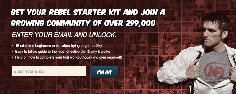
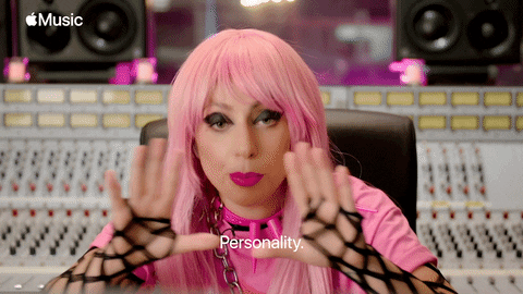
This CTA by NerdFitness hits on all the targets. The text of the CTA “I’m in!” is unique, yet clear. The color is in contrast with the rest of the background. The size is not too small and not too big, but just right!
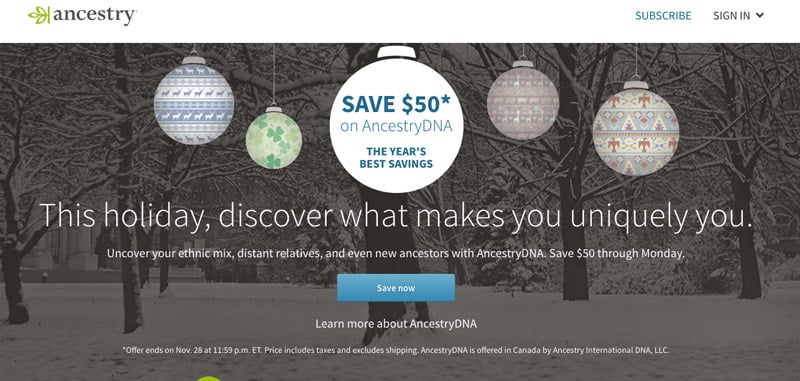
Less is more with this CTA. It works because the benefit is made clear, and the word “now” suggests immediacy and urgency. The only critique here is the color—blue is just too close to green for it to stand out, but maybe “subtle” is what their brand is going for.
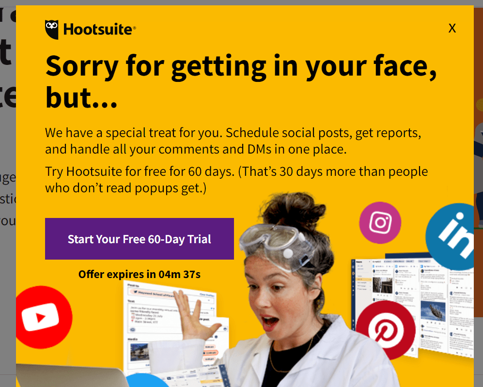
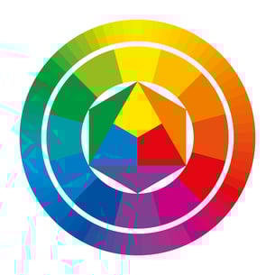
This CTA uses specific language that clearly states the benefit to the user. What we especially like about this CTA is that it makes use of the triadic colors yellow and purple!
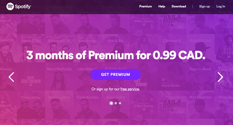
Notice that this short CTA works in context of the landing page copy. Otherwise “Get Premium” wouldn’t make any sense. Another notable feature of this CTA is the color: even though purple is right next to pink on the color wheel, the effect is lovely to look at!
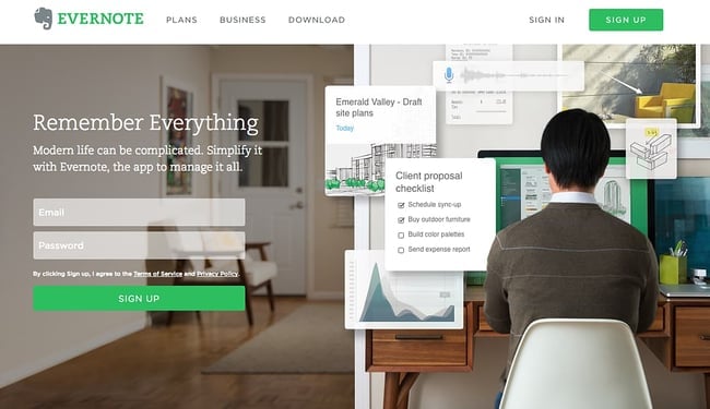
Notice that Evernote’s CTA matches their brand color, bright green. However, they’ve made sure that the background photograph stands in stark contrast to the color of the CTA. Additionally, they’ve included an extra CTA in the upper righthand corner.
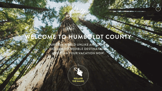
Not only do we love the creative wording and design of Humboldt County’s CTA, but we love the contrast between the deep, earthy toned photograph in the background and the white, simply-illustrated CTA in the foreground.
If, after all the advice and helpful suggestions, you feel like you could live your whole life without seeing another CTA ever again, call on the experts at Wild Fig Marketing!
Not only can we write the perfect CTA, but our marketing team can also write your blogs, emails, and other content!! Schedule an exploratory call with us today to find out how we can help you convert more prospects (did you spot the CTA?). We look forward to working with you!
![Why It’s Crucial To Humanize Your Brand in the Age of AI [+ 12 Ways To Do It]](https://www.wildfigmarketing.com/hubfs/bigstock-Two-cheerful-small-business-ow-277396642.jpg)
1 min read
With increased adoption of smart technology, AI, and automation, brands have the opportunity to accomplish more faster—potentially outperforming even...
1 min read
Many businesses use holiday newsletters as a chance to boost sales and announce last minute deals. Other companies opt to use their holiday...

1 min read
When Bill Gates wrote the essay titled “Content Is King” in 1996, he couldn’t have known that it would turn out to be a slogan wielded by content...